Tutorial for the illustration "Nestworking"
The Asian/Pacific site of Wacom are currently showcasing a walkthrough of mine on how I create an illustration from scratch. I have reproduced it here and hope it gives some insight into how I work a drawing up from sketchbook draft to finished digital artwork. Enjoy!
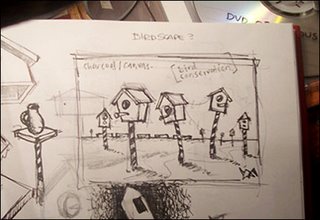
1. It Begins..
Everything starts with an initial sketch. This is usually something I map out briefly on paper, although I do at times go straight onto screen using the tablet. In this case I have used a recent pencil drawing from my sketch book which I scanned and “cleaned up” a little in PhotoShop.
I scan my line-work in grayscale at either 300dpi or 600dpi and import it into PhotoShop. I raise the line-work from the background by placing it on its own separate layer. I duplicate this layer and use one specifically for colour. I’ll try and not bore you with the technical details as I often create several layers throughout the illustrations I do. Let’s concentrate more on colour..
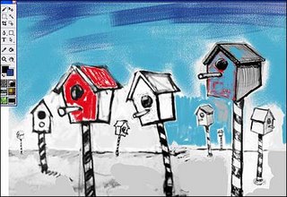
2. You say Color I say Colour!
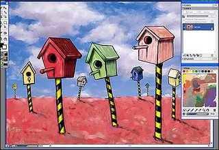
With the drawing saved as a PSD I open it up in Corel Painter and get the show on the road with some broad sweeps of the background. I’m also trying to get a feel here for what colour each of these bird boxes will be and you will notice I have already decided which one will be red.
Incidentally, although my Intuos 3 works perfectly fine without it, I still like to tape a sheet of textured paper on top of the drawing slate. I find that the extra “tooth” of the paper gives a more natural feel to the whole thing, especially as I do a lot of traditional media works on paper. It also gives me somewhere to write things like “don’t forget to put out the garbage”!
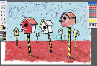
3. Off with the Birds..
I continue to map out the colour in the Painter program using a combination of oil brushes and pastel. I will be building up a warm foreground as it progresses, layering colour over colour.
4. Caution – Wet Paint
At this stage I’m still messing around with the background and decide on working it up into a nice cloudy sky. The freedom and accuracy of the pen in comparison to using a mouse in a drawing like this is like chalk and cheese.. and in combination with programs like Painter I am continually amazed at how close it comes to looking like real traditional media.
5. Hey You, get off of my Cloud..
Speaking of traditional media, there’s a great little mixing palette in Painter (seen here at the bottom right of the image) where you can “dip your pen” and literally mix the colours just like the real thing.. no messy turps wash up here although I miss the smell of the linseed oil!
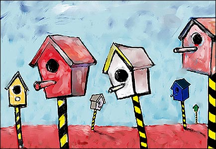
As you can see I have an expressionistic skyline happening and really made some progress on the bird boxes. I decided to make the middle one green.
6. Burn Baby Burn
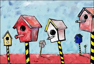
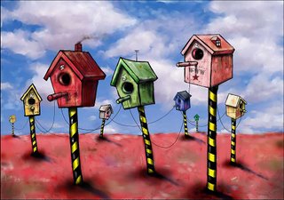
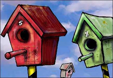
At this stage I take the image back into PhotoShop for another makeover. Some of my favorite tools in PhotoShop are the Dodge and Burn tools. In short, the Dodge tool will lighten areas of the image whilst the Burn tool darkens them. If you use them wisely and adjust the range and exposure, you can create some very subtle shadow and highlight areas. I have used these on the bird boxes to help indicate the direction of light. You may also notice I have added numbers too, now turning them into bird “houses”. I also brushed in some scratches, splotches, stains and other marks for added pizzazz..
7. Birdscape?
Getting close now.. Using a combination of Painter and PhotoShop I’ve tidied up the sky and worked on the foreground adding colour washes and texture. The trusty Burn tool gave me the shadows at the base of the bird houses and I used the Dodge tool once again to place highlights on each of the posts.
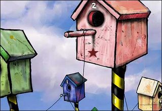
8. A Star is Born..
You can get a lot of free PhotoShop brushes on the internet whilst others come at a price or with copyright conditions. I found this star whilst browsing my own PhotoShop brushes and just thought I would drop it in somewhere. I also added the wire which binds or networks all of the bird houses together.
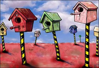
9. Hey Presto! It’s “Nestworking” (click image to enlarge)
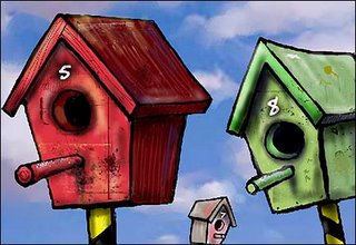
As you can see, I have decided to give the bird houses a “lived–in” look with the addition of a chimney, ariel and window… couldn’t help myself.
There’s also a reference to the whole networking theme with a conspicuous “www” stencil painted on one of them.
The wires were produced by long elbow sweeps with the pen stroke at a fine setting. In some cases I had to click the “step backwards” button in PhotoShop to delete previous swing attempts that just didn’t have much curve.
One of the last steps I perform with each illustration is to make level or curve adjustments for tone and then some final UnSharpening to make the whole thing zing..
So there you have it, a brief breakdown of my illustration process which I hope made some sense.
See you on the other side of the canvas!
- Leith (feel free to make comment at the link below)

1. It Begins..
Everything starts with an initial sketch. This is usually something I map out briefly on paper, although I do at times go straight onto screen using the tablet. In this case I have used a recent pencil drawing from my sketch book which I scanned and “cleaned up” a little in PhotoShop.
I scan my line-work in grayscale at either 300dpi or 600dpi and import it into PhotoShop. I raise the line-work from the background by placing it on its own separate layer. I duplicate this layer and use one specifically for colour. I’ll try and not bore you with the technical details as I often create several layers throughout the illustrations I do. Let’s concentrate more on colour..

2. You say Color I say Colour!
With the drawing saved as a PSD I open it up in Corel Painter and get the show on the road with some broad sweeps of the background. I’m also trying to get a feel here for what colour each of these bird boxes will be and you will notice I have already decided which one will be red.
Incidentally, although my Intuos 3 works perfectly fine without it, I still like to tape a sheet of textured paper on top of the drawing slate. I find that the extra “tooth” of the paper gives a more natural feel to the whole thing, especially as I do a lot of traditional media works on paper. It also gives me somewhere to write things like “don’t forget to put out the garbage”!

3. Off with the Birds..
I continue to map out the colour in the Painter program using a combination of oil brushes and pastel. I will be building up a warm foreground as it progresses, layering colour over colour.
4. Caution – Wet Paint
At this stage I’m still messing around with the background and decide on working it up into a nice cloudy sky. The freedom and accuracy of the pen in comparison to using a mouse in a drawing like this is like chalk and cheese.. and in combination with programs like Painter I am continually amazed at how close it comes to looking like real traditional media.
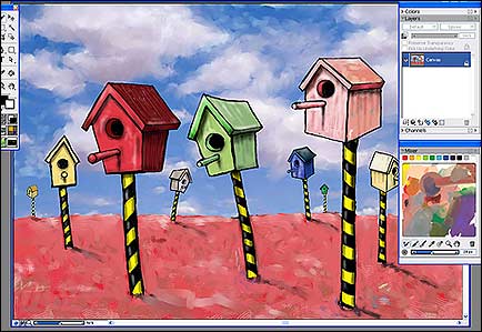
5. Hey You, get off of my Cloud..
Speaking of traditional media, there’s a great little mixing palette in Painter (seen here at the bottom right of the image) where you can “dip your pen” and literally mix the colours just like the real thing.. no messy turps wash up here although I miss the smell of the linseed oil!
As you can see I have an expressionistic skyline happening and really made some progress on the bird boxes. I decided to make the middle one green.
6. Burn Baby Burn
At this stage I take the image back into PhotoShop for another makeover. Some of my favorite tools in PhotoShop are the Dodge and Burn tools. In short, the Dodge tool will lighten areas of the image whilst the Burn tool darkens them. If you use them wisely and adjust the range and exposure, you can create some very subtle shadow and highlight areas. I have used these on the bird boxes to help indicate the direction of light. You may also notice I have added numbers too, now turning them into bird “houses”. I also brushed in some scratches, splotches, stains and other marks for added pizzazz..

7. Birdscape?
Getting close now.. Using a combination of Painter and PhotoShop I’ve tidied up the sky and worked on the foreground adding colour washes and texture. The trusty Burn tool gave me the shadows at the base of the bird houses and I used the Dodge tool once again to place highlights on each of the posts.

8. A Star is Born..
You can get a lot of free PhotoShop brushes on the internet whilst others come at a price or with copyright conditions. I found this star whilst browsing my own PhotoShop brushes and just thought I would drop it in somewhere. I also added the wire which binds or networks all of the bird houses together.

9. Hey Presto! It’s “Nestworking” (click image to enlarge)
There’s also a reference to the whole networking theme with a conspicuous “www” stencil painted on one of them.
The wires were produced by long elbow sweeps with the pen stroke at a fine setting. In some cases I had to click the “step backwards” button in PhotoShop to delete previous swing attempts that just didn’t have much curve.
One of the last steps I perform with each illustration is to make level or curve adjustments for tone and then some final UnSharpening to make the whole thing zing..
So there you have it, a brief breakdown of my illustration process which I hope made some sense.
See you on the other side of the canvas!
- Leith (feel free to make comment at the link below)
posted by Leith O'Malley at 4:39 AM
3 comments
![]()
![]()