Thursday, July 28, 2011

South Australian Living Artists - August 2011


Art and Food Dept.
If you're in Adelaide during August, I have several works hanging in Celsius... the now number one Contemporary SA Restaurant 2011. 
Also, if you're hungry how's this: Ayhan Erkoc from Celsius was declared "Best Chef" in the Restaurant and Catering SA's annual awards for excellence at the Adelaide Convention Centre on Monday night.
Adelaide artist Meaghan Coles along with myself will hopefully be trying to match the amazing art on the plates from Ayhan and his staff with equally interesting art to digest..

Monday, February 14, 2011

Food for Thought.


Art and food.
I’ve always loved the combination. There’s something about experiencing interesting art over good food and wine.

I’m sure I’m not the only one guilty of contemplating an abstract, landscape or figurative painting across a table whilst in conversation or waiting for an entrée or main course to arrive. Mind you, I’m easily distracted when it comes to art, particularly paintings or drawings.

In what is now the second time I have exhibited paintings in a city restaurant, I am pleased to announce an exhibition of mostly new or unseen works at Celsius Restaurant & Bar in Adelaide, South Australia.

It’s funny, many artists might baulk at the idea of exhibiting anywhere outside of a gallery space but I simply love the opportunity and environment, especially knowing that the works are experienced for a far longer period of time and often by a wider range of people as they study, scrutinize or simply glance over at the works during warm conversation and culinary delights. Often this is some diners first or only introduction to contemporary art, as many don’t dare step inside a proper commercial gallery space.

So it is.
What I can tell you is that this particular restaurant is noted for creating art on a plate and has recently picked up a “best new restaurant” award in Adelaide.
It’s run by two charming brothers Kasim and Ayham Erkoc.

Ayham, who was awarded the title of Chef of the Year in 2008, has worked at this year’s ruling best restaurant of the year, in the world, that is, Noma, in Copenhagen, as well as Marque and Pier in Sydney.
Hopefully having my work on the walls there will be complimentary to the art on the menu, and that just for a moment they too might be distracted from their day to day lives by canvasses of thick paint.


So, want to check out my recent work over a great meal?
Here’s where to head if you’re in the neighborhood..

Celsius Restaurant and Bar
95 – 97 Gouger Street
Phone: 8231 6023
celsiusrestaurant.com.au
Mon and Sat: 6pm – Late
Tue – Fri: 12pm – 2.30pm, 6pm – Late 


Here's a selection of the works available for sale at the restaurant. Just click on an image to enlarge. There is a close-up of the painting surface below each image.


TITLE: “FREE YOUR BIRD”
MEDIUM:  OIL & COLLAGE ON CANVAS
H X W: 75 x 40cm


TITLE: “LETTER FROM VINCENT (VAN GOGH)”
MEDIUM:  OIL ON CANVAS
H X W: 100 x 75cm


TITLE: “GIRL ON A WHITE CANVAS”
MEDIUM:  OIL ON CANVAS
H X W: 101 x 75cm


TITLE: “SAVE YOUR BREATH”
MEDIUM:  OIL ON CANVAS
H X W: 120 x 90cm


TITLE: “LETTER FROM FRIDA (KAHLO)”
MEDIUM:  OIL & COLLAGE ON CANVAS
H X W: 76 x 50cm


TITLE: “THE CROSSROADS”
MEDIUM:  OIL ON CANVAS
H X W: 100 x 75cm


TITLE: “THE YELLOW HIJAB”
MEDIUM:  OIL ON CANVAS
H X W: 101 x 75cm


TITLE: “SPEAK NO ART”
MEDIUM:  OIL & COLLAGE ON CANVAS
H X W: 60 x 50cm 


TITLE: “HARD JAZZ CAFE”
MEDIUM:  OIL ON BOARD
H X W: 120 x 92cm


TITLE: “GONE FOR COFFEE”
MEDIUM:  OIL ON CANVAS
H X W: 122 x 92cm


Celsius Restaurant and Bar
95 – 97 Gouger Street
Phone: 8231 6023
celsiusrestaurant.com.au
Mon and Sat: 6pm – Late
Tue – Fri: 12pm – 2.30pm, 6pm – Late


A recent article from "Adelaide Now".
One of the paintings is featured in the photo.

FIVE is the magic number.
Five of Adelaide's best chefs showcased their talents in a unique dining event at Celsius Restaurant last night.
The dinner had five chefs, five courses and five wineries, with the event aiming to raise $10,000 for the children's family cancer charity, Camp Quality.
Lachlan Colwill with Emma Shearer from The Manse (who were counted as one), Ayhan Erkoc from Celsius Restaurant, Vincenzo LaMontagna from Vincenzo's Cucina Vera, James Brinklow from The Lane and Johny Triscari from Chloe's each created one course at the dinner, matched with wines from Natural Selection Theory, K.T, Alpha Box and Dice, Samuel's Gorge and BK Wines.
Executive chef at Celsius Restaurant Ayhan was chuffed with the event.
"Adelaide's dining scene is alive," Ayhan says.
"We are all passionate about food in this city and by coming together for this event we are learning from each other, having fun, raising money for charity, and we give people an amazing food and wine experience."

Saturday, December 18, 2010

Group Exhibition at The Urban Cow..


One of my illustrations will be part of an exciting exhibition featuring a variety of  Australian Illustrators at the funky "Urban Cow Gallery" in Adelaide during January 2011. 

The exhibition "Nursery Rhymes" will open on Wednesday January 5th and run through to January 28th. If you're in the area, come along to the opening at around 6pm on the 5th!
Here's some detail and images to guage an idea of the quality of the work on display.. 

Please note that the images below are not necessarily showing in  the exhibition but serve as an example or indication of some of the participating artists style of illustration.
 
ABOUT: Nursery Rhymes is an exhibition inspired by the dark point of reference of traditional nursery rhymes.  It is an exhibition featuring a group of creatives that have chosen one nursery rhyme. Each creative built their art work around the nursery rhyme, in their chosen medium, to showcase their signature style.
 Each of the participants in the exhibition arrive from a wide range of disciplines, from art and illustration to graphics and apparel within the creative industry.  Many of the artists are multi-disciplinary and have had group and solo exhibitions of their work and have had their work emblazoned across tee-shirts, banners, books and magazines.
This exhibition at Urban Cow Gallery gave each of the artists an opportunity to demonstrate their creative passion in any way they chose, creating an exhibition of awe inspiring beauty, colour, sinuous line work, and textures, whilst expressing the creative vision of each of the participants.  To have such a diverse range of artists with distinct styles, interests, view points and focus, each creating a piece to be held together by the concept of a nursery rhyme, makes for an interesting, visually challenging and inspiring exhibition.

Opening night: Wednesday January 5th 2011
Time:
 5:30pm
Urban Cow Gallery
: 11 Frome Street, Adelaide
Exhibition runs until Jan 28th
The artists in the exhibition are:
Anita Alcorn – Melanie Allen – Sam Barratt – Siobhán Boughton – Courtney Brims - Letitia Buchan – Peta Alannah Chigwidden – Jordan Clarke – Anna Creasy – Klaus Kinski – Milo Kossowski – Beci Orpin - Leith O’Malley – Elisa Mazzone – Suzanne McPherson – Anna Moretti – Naomi Murrell – Wendy Olsen – Lilly Piri -  Nani Puspasari – Joshua Smith – Eugenia Tsimiklis – Ella Versteege – Bec Winnel – Sally Wren – Nancy Alice Wood

My own piece in the group show is an interpretation of the nursery rhyme "Little Boy Blue" and is somewhat of a return to my cartooning roots. I wanted to present a new take on it.. a different angle. 

What if the story behind this boy with the horn came from contemporary folk lore? 
What if Boy Blue was a young jazz player who was forever on the road with his band The Meadow? 
What if his sleepiness was the result of playing his horn every night in clubs like The Haystack?

I wonder what music these sheep headed musicians lay down behind Boy Blue's trumpet solos? Maybe some of it might be from Miles Davis's "Kind of Blue" album which I had playing for my own inspiration during the construction of this painting..or maybe something from Tom Waits "Blue Valentine" perhaps?


Sneak Peek: Close ups of the illustration I created for the exhibition. The reference to "Birdland" (as mentioned in my previous blog post) is a famous jazz club in New York. The final illustration is approx 30 x 42 cm (H x L) in oil and collage.


Click on the image above to see the final work. Any comments welcome below..
The original will be available for purchase. 
I will also be making available a short run of signed limited edition prints (30 only @ 42 x 30cm).

Monday, December 06, 2010

No Sleep Till Birdland.

So there’s this thing I do.
I always have paint left over on what ever it is I’m working on at the time.
All sorts of unused pure pigment, coloured premixes or subtle glazed medium that didn’t end up on the drying canvas. It seems such a waste to just scrape it all off into a waste bin and I don’t really like to let them mount up on the palette like some artists do.
It’s my little indulgence at the end of the painting hour if you will. My own little ritual. I use this left over paint on a separate work in progress.
So this was the beginnings of “Birdland”, the latest in a line of  left over meanderings, residual after thoughts whisked off a brush or scalpel in conscious self indulgence at the end of a night.
I’m happy with the result, especially as I watched the piece over several months take on a different look, a different layer of meaning with every layer of paint. 
It’s a mixed media in the true sense of the word. If I happened to be working on a paper collage drawing at the time then on would go some collage. If another night I was using gold leaf on a painting then some of this would also end up on Birdland.
I even resisted the temptation to paint over my pencil lines so the picture is a real combination of different media, an unusual jigsaw that evolved as a result of not only the materials used on its surface, but also the juxtaposition of  Klee-like abstraction and colour with the roughly sketched pencil drawings of birds.
For me it is successful in that it breaks a few rules of what a painting is supposed to look like.
The birds are not new. I have made reference to these particular feathered friends in some of my other work in recent years. They are “New Holland Honeyeaters” and are a very common bird around my neighbourhood here in South Australia. My favourite bird in fact.
Several like to make their homes under the tiled roof of my studio each year and I am always hearing them scurrying about up there or feeding their young. Maybe it’s the protection that roof space provides for raising their young, but I prefer to think it is the music emanating below them that sees them return time and time again.
The title “Birdland” actually has a double meaning.
It is also a reference to the famous jazz club that was established in New York in 1949 and named after the saxophonist Charlie "Yardbird" Parker.
As much as I love many genres of music, I’m a bit of a jazz head and even play a little saxophone myself. I’m no Bird, far from it.. but being able to mix art and music does make me feel like I have some licence to fly.


*********************************************************
“All composition left to chance.
Technique a trap you set yourself.
To prize apart your own resemblance,
and free the bird inside your head”.


*********************************************************


Ok, feel free to comment below.. gotta fly…


Sunday, November 07, 2010

Art is Music, Music is Art – Just ask Big Joe.


If there’s anything that can distract me from creating art it is good music.
Listening to it, creating it, being surrounded by it.. it’s something that was constantly around me growing up and I am seldom far from listening to the music I love whether I am at home, in my studio or driving my car.
All my family are musicians, I have two brothers and two sisters, all of them sing and play guitar exceptionally well. In and out of bands and also recording their originals.
My dad “Mike O’Malley” was in fact a pioneer of Australian Country Music and has been honoured more than once for his years of contribution to that genre of music and the early recording industry in this country (Rodeo Records).
In fact, it wouldn’t surprise me if he still has some of the cement under his finger nails from his Tamworth Hands of Fame induction a few years ago now.
Dads old guitar has taken some mighty plectrum use around the barbecues and kitchen tables of my youth and onwards. My brothers and sisiters and I would take our turn on his knee early on, but there was also a beautiful 1950’s Gibson guitar to compete with. To this day I am yet to hear a guitar with a warmer tone than that piece of family history.
So anyway I am really fortunate to have experienced a rich musical upbringing and it’s something I’m not only proud of, but also feel (like art) has enriched my life in many ways. Being open to and discovering so many incredible forms of music and ways of making music is a kind of wonderment that continues to be a fascinating and addictive pastime.
Which brings me to the reason for this particular blog posting. You knew I’d eventually get there right?!
Occasionally I get an opportunity where I can mix these two together.. art and music.
Some of you will already know about the artwork and design I provided for the Mercedes Garcia release “Cross My Heart”, but another recent and just as interesting design based project involved providing the cover art for something closer to home.
Anyone who knows me well will tell you how much I really enjoy roots, blues and jazz music so this opportunity was an easy one to say “yes, let me at it”.
Apart from the fact I occasionally play in some local blues outfits (amplified blues harmonica and saxophone), I also enjoy creating much of the promotional material (logo, posters and ticket designs) for a popular live blues night in my neck of the woods known as “Live @ Lefties”.
My involvement in creating the cover art for a new CD compilation I am about to speak of came about after Jacob of the studio label Stobie Sounds saw some of the work I was doing promoting these Lefties blues nights.
After some detail and discussion on what Jacob had in mind, I submitted a few alternate images and the result is the cover art we see below for the album.. a composite image of photo reference and hand drawn line art that has been given the simple “mono print” look that has become so indicative of the Stobie Sounds branding.
At that stage I had heard a little about the label from it’s growing reputation for creating quality glass bottle-neck guitar slides, as well as recording home grown (Adelaide) musicians. I was pleased to learn that my work would be contributing to an eclectic, brooding and earthy recording of blues that would feature reinterpretations of the songs of the American stalwart blues musician “Big Joe Williams”.
I was also anxious to not only see how my image of Big Joe turned out in print, but also hear what lay within the CD package itself.
I couldn’t have been more pleased when the postman arrived with copies of the CD. The record label has done a remarkable job with the production throughout, both in a visual and aural sense. The labels branding entails hand printed covers onto recycled cardboard sleeves and includes everything people love about buying records.. interesting liner notes, good artwork (yeah I can blow trumpet too) and good design.
The album is made up of sixteen tracks and features both Australian and US based musicians giving their own take on the Big Joe Williams originals. The liner notes have been generously provided by recording artist and ABC announcer “Lucky Oceans” (who I read actually spent time with Big Joe in his youth), and includes a 12 page booklet with everything you’ll ever need to know about the big man.
For music connoisseurs, Stobie Sounds is a roots record label from Thebarton in South Australia and they specialise in putting out small releases of 50-500 albums which are marketed and promoted to a small selection of independent media and record stores in Australia and the US. Real collector items just quietly.
Anyone interested in purchasing the Big Joe Williams album or learning more about Stobie sounds should head to http://www.stobieandco.com/stobiesounds/?page_id=3&category=13&product_id=29

Thursday, October 28, 2010

"Worlds Apart". {a postcard from Down Under}


“I love irony and that is evident in your work - but in the irony is also sadness and reflection which is born from deep thought” - Jennifer Groome.

Breathe out.
It arrived.
Finally.

It’s always a bit of a worry, sending original art overseas.
Particularly when the work is winging its way from Southern Australia to Verona, Italy.

Such was the case with a recently completed canvas I had titled “Worlds Apart”, a literal reference to it’s destination in some respects, although the title had its origins in a more metaphorical analogy of choice, difference and balance.
Did I say metaphorical analogy? I think I’m just about ready to write that new artist statement hehe..

It’s a long story but this painting was a commissioned work for someone who has taken great interest in my art practice during the last few years, and I was keen for it to arrive safe and sound. After some initial postal tracking confusion, I’m happy to say the work now hangs safely in the home of its new owner Jennifer, her husband Tarcisio and daughter Sophia.

I have known Jennifer for some time now. I originally created the gig poster for a band she was in called “Doppio Malto” and in recent times she has done a cracking job of recording some prose of mine, a side project I am still working on.
Some months ago her husband Tarcisio granted her a birthday wish of purchasing one of my oil on canvas works.


It’s kind of a small world you know.
I mean, this whole networking and friendship forming phenomena reminds me so much of a time when I was about thirteen years old receiving pen friend postcards in the mail from Europe.
This time the picture on the postcard becomes a link to many more pictures from an image gallery and the scribbled text on the reverse side of the postcard has metamorphosed into globe trotting short messages or email.
It’s fascinating and at once astonishing how we can now communicate with people across the country and around the globe, and although I now take it for granted, it still amazes me how far we have come.
But I digress.

I wanted to post this painting earlier but needed to wait until it was in the hands of it’s new owner.. why spoil the surprise right?


The best thing about this private commission was that there were no conditions. Jen made it clear early on to “paint it for yourself, don’t email me any work in progress images.. and then post the painting to me” so that’s precisely what happened and it became a joy to complete.
That’s not always the case with commissioned work and it brings me to another point about the difference between selling artwork as a private commission versus gallery sales from an exhibition of your own work.

In my experience there is quite a lot of anonymity involved in who is buying your work from a gallery. I don’t include all galleries in this but the buyers identity are kept at arms length it seems.
I suspect the gallery does this to protect themselves from artists approaching these people outside of the gallery (for further or future sales avoiding gallery percentage on sale fees). I can understand that. They are a business and I respect that also, but I still like to know who is buying my work and why.

Believe it or not this infatuation with creating art isn’t about money. I’m not selling time, effort and materials in my work.. it’s not craft… I’d like to think people are not only buying something of aesthetic resonance or investment value but also a real creative component. Something of me.

In a response to the arrival of her new painting Jennifer wrote “I have a piece of your imagination in my home Leith, that is how I feel about it" and further it contains so many references to your other work which I have always admired”.


Unless you are speaking to buyers or art enthusiasts on exhibition opening night, feedback is few and far between once your work is sold. I’m not talking about ego stroking but genuine feedback and an interest in what it is that people like in your work enough to purchase it.

Maybe it says more about the person buying an artists work but it really means so much more when you know the buyer connects to your work, and in this case the buyer clearly has.

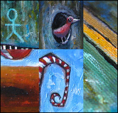
The Jack in the Box has a very sad face Leith, almost as if the two worlds he is holding up are a burden to him. He doesnt want to go back into his box actually. He could have been a smiling person, but he isn’t and this makes him even more interesting. 


The little bird - his alter-ego, or his friend, wants to fly away and could but chooses not to because he wants to simply stick around. Seeing that bird really made my heart jump because I knew then that your heart had gone into this painting - I love it when that bird pops up in your work. And the allusion to the music - to the piano. Which is where he now lives in my music room, so that is just perfect of cours”.


 “Sophia says the Jack in the Box is sad because of the two worlds he is holding he does not know which one to chose and his eyes are fixing the beholder almost desperately trying to find an answer to that question. Which world does he want - the coloured one or the greyscale one”.

I’ll take this opportunity to explain a little about those two worlds.
Around the time I was painting this Jack in the Box image I was also working on some digital logo work. It was all greyscale stuff and the decision making was more to do with font choice, dimension and form.
It was so liberating to leave that work every now and again and work on the painting. Pushing actual paint around a canvas with a brush and being seduced by so much colour. It was like respite from that other stuff. Worlds apart.

That is the genesis of where the two dangling temptuous worlds of colour, tone and choice come from.. me working on other mediums and it then feeding itself back into the piece I was painting.
Whether it’s colour or greyscale, I’ll always waltz between the two. Painting and drawing, charcoal and brush, computer and canvas, love and insanity.


Elaborating on her new painting Jen continues:

Much art that I admire, and maybe this is because I am a simple little soul, contains wonderful colour. I love Paul Klee for example - just like I also admire other types of art, Bauhaus, post expressionism, pop art - and I find modern art more fascinating than old Rembrandt or Constable, or even Joseph Wright from Derby - who painted light like no one else.
Paul Klee loved colour too. But even more than that, like you and me he was a musician at heart and his musicality, in my opinion, comes out in his work - as it does yours. It is not easy to describe how it does, it just does. I suppose it is a certain feeling of liberation and exploration.
But I am not going to rabbit on about Paul Klee now...although I will just say that he abandoned his music because he found the music around him, the so called successful music of his particular time, banal and uninteresting. He could be living in todays society with our modern bland music - he would hate it. Art libertated him, music trapped his creativy.

 
Henri Matisse said that to me this evening Leith - he came round for a beer bless him, Picasso, his mate had just left..

Thankyou Jennifer. Thankyou for reminding me of the value in what lies beneath the paint and the recognition by some of what has been woven within it.

It’s a pity I missed Henri and Pablo you know. We could have painted the town red.

It’s a good day for art..
Breathe in.